Speeding up fundraising – website heuristic analysis for UN Women Finland
For many organizations, the biggest challenge in improving a site often involves taking the first step. It can be stressful to think about where to even start.
Should the navigation be clarified? Should in-site search work better? Is the form process too difficult from the user’s point of view?
In such a situation, we recommend heuristic analysis. It is an excellent starting point when you want to improve the user experience of your site and thus the likelihood of conversion.

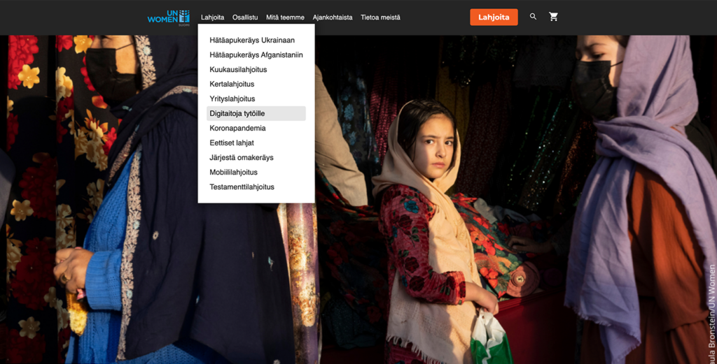
UN Women is a UN gender equality agency that aims to promote gender equality and improve the human rights of women and girls worldwide. In Finland, the organisation’s committee is UN Women Finland, whose website unwomen.fi is a key tool in the organisation’s communication and fundraising.
UN Women Finland has made changes to its website. The organization wanted to ensure that the changes made to the site would support fundraising and recruiting new members as well as possible.
Heuristic analysis helps to list areas for improvement
Heuristic analysis is an audit performed by an expert based on a researched and patented framework. It is not an expert’s personal view of the site, but a process that helps to map out the problem areas of the site that stand in the way of the goals of the site.
Problem areas can be related to, for example, usability, clarity or various elements that unintentionally cause friction to the user.
Even a good user experience is not enough in itself to lead the user towards conversion. The site must also be able to state its value proposition, i.e. justify why the user should do the thing that is expected of them in the first place. Appealing to motivation is one of the most important factors influencing conversion.
Our website is a vital tool for UN Women Finland’s communication, fundraising and advocacy work, and the analysis we received from Dagmar was extremely useful for us. Not only did Dagmar’s experts take their time to carry out the analyses, but they also gave us their undivided attention to go through the results of the analysis in detail.
Emma Winiecki, Communications Officer, UN Women SuomiThe analysis reveals areas for improvement on the site
Dagmar’s heuristic analysis helped UN Women Finland find and improve areas on its website that can be developed to make the user path smoother and more efficient in collecting donations.
On the UN Women Finland website, donation payments are reliable and secure. Still, it is the pages related to payment that often cause the most uncertainty among website users. The analysis helped UN Women Finland draw attention to small changes that strengthen the user’s secure payment experience and increase the likelihood of a donation.
Mobile users often have a clear goal in mind. From the point of view of such users, it is important to ensure that nothing on the site prevents the user from doing what he wants to do. With the help of heuristic analysis, UN Women is able to make the site easier to use also on mobile.
In particular, usability challenges at the end of the conversion path are important for multi-site business. If a motivated user runs into an obstacle on the site, most likely he will not go back to try a second time. Such problems are surprisingly common on websites and site operators are not aware of them.
With Dagmar, we can more effectively build a world where gender equality is realised and, above all, raise much-needed funds for UN Women’s global work for girls’ and women’s rights around the world. It’s impossible to even put a price tag on this kind of work – it was invaluable to us.
Emma Winiecki, Communications Officer, UN Women SuomiMore of our work


